
Located in Austin Landing, Dayton Cars and Coffee has been hosting car meetups for passionate car enthusiasts in the Dayton community. The UX elective at the Modern became a UX agency to design a website, and social media strategy for our client. We also partnered with the Modern's branding elective to create a new brand for Dayton Cars and Coffee.
I clarified research findings with Angelica to execute the sitemap for Dayton Cars and Coffee. I lead the execution of wireframes for Dayton Cars and Coffee’s new site. I communicated with the lead designer and design directors to deliver the required content within web pages. I also presented wire frame prototypes and conducted user-testing.
The public perceives Dayton Cars and Coffee as a tightly knit community that is continuously growing. Its community refers to Dayton Cars and Coffee as DCC for short. DCC is located in Austin landing, and its location houses historical significance regarding the relationship with Dayton’s automotive history. The community strives to preserve Dayton’s automotive culture. Cars and Coffee meets have been around for decades.Its increase in popularity and growing sponsors has set new aspiring goals to continue to grow and new brand launch.
Redesign Dayton Cars and Coffee’s website, so it allows users to easily access the information they need while also encouraging them to dive further into the site.
Creating exclusive merch to show off Dayton Cars and Coffee pride and connection with the community.
Redesign the Dayton Cars and Coffee’s brand to represent theDayton community and its automotive history.
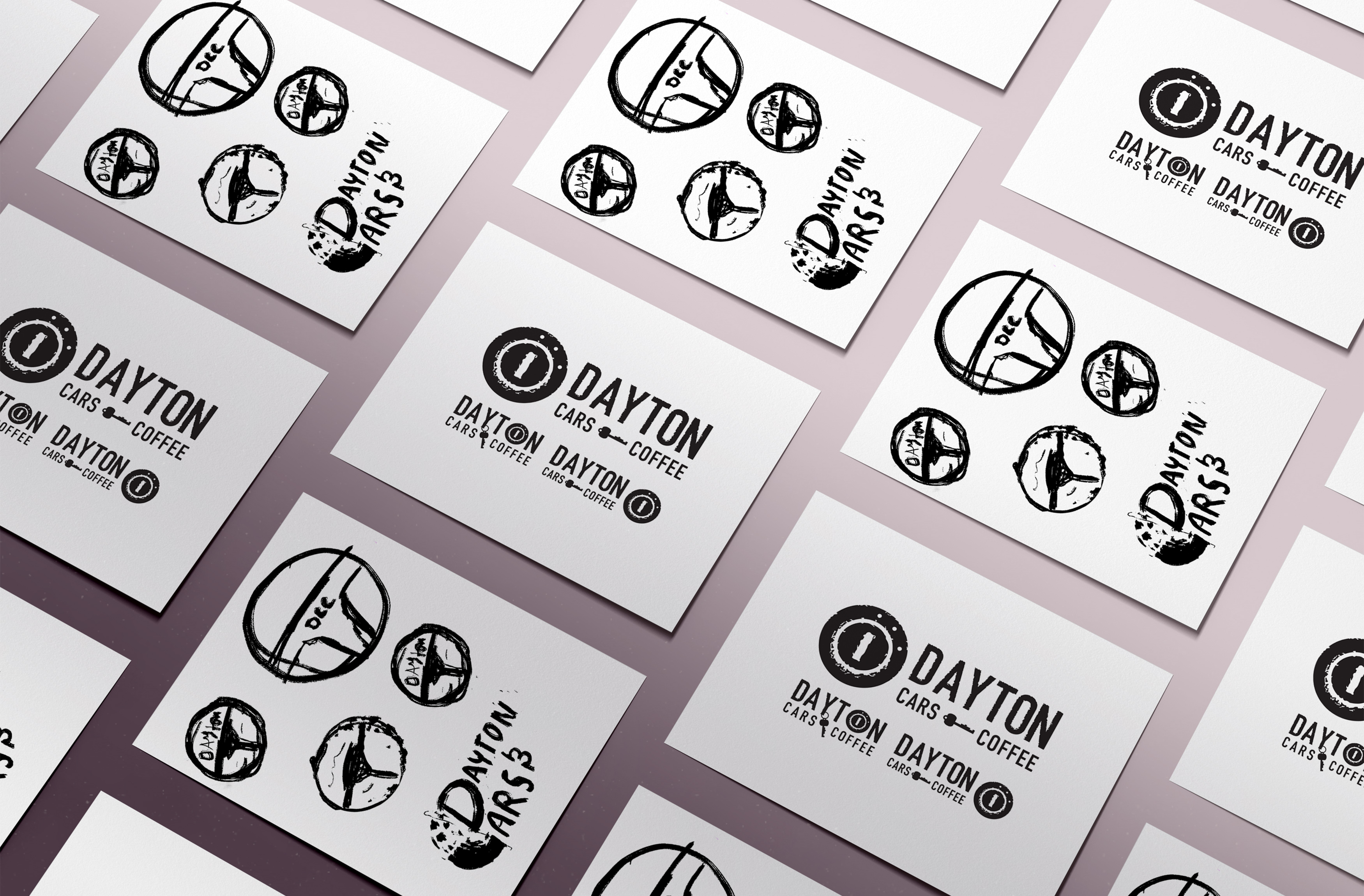
The user experience team collaborated with individuals from the branding elective at the Modern College of Design to help execute Dayton Cars and Coffee’s new brand launch. Our first client meeting cultivated different brand directions. We started by ideating and sketching to establish a direction. Together we further developed our branding directions, by sketching and digitizing our ideas.

Its concept was cultivated from an early morning routine of placing the keys in the ignition to start your day and grab a cup of coffee. The concept included a key a hole and a set of keys to represent the keys to the Dayton Cars and Coffee community


Together we reviewed our directions to decide which creative direction should be further developed Dayton. By dividing into two separate groups we were able to execute style scapes, iconography, and merch with the guidance of Logan hill for the first group and the guidance of Madison Hosier for the second group.
The groups lead by Logan Hill from the branding elective and our project manager, Madison Hosier.Together they lead their groups to further developed their concepts with merch, style scapes, and iconography.
In the early stages I had the opportunity to collaborate with Logan Hill’s team from the branding elective to conceptualize iconography for his comp direction before diving into site research with my user experience team.
I created branding elements to help Logan’s team identify a style and direction for Dayton Cars and Coffee, that includes graphics, logo variations, and Iconography. The client pondered through different logo variations before settling on a direction therefore we explored many different directions to facilitate his decision-making process.

Logan’s branding direction and brand guide became the foundation for Dayton Cars and Coffee’s new site.
The user experience team executed the competitive review as well as the heuristic and content audits. Each individual would separately answer questions regarding the heuristic audit to ensure recommendation accuracy. To speed up productivity, our team divided into two groups to execute the competitive review, content-audit,Social Audit, and Keyword/SEO Audit. Dayton Cars and Coffee is one of the most significant events in the Dayton area. Their meets are designed for all automobiles, old, new, and worn. Its site accumulates much traffic, it’s mission is community-driven, and they have a large selection of photos.
Together, we analyzed the Dayton Cars and Coffee’s current site to gauge its usability, efficiency, and effectiveness. The Heuristic audits reveal potential opportunities to develop the Dayton Cars and Coffee website better. Our results are based on find-ability, consistency, aesthetics, and accessibility. The Heuristic audit revealed these flaws:
These are Dayton Cars and Coffee’s closest competitors who share high web traffic. However, the client does not view themas competitors because the Cars and Coffee culture support each other.
One of the nation’s most popular Cars and Coffee. They place their sponsors on a separate page. Their footer has helpful links to navigate users through the site. They have excellent imagery, but the site has a slow load time. Its beautiful and colors are easily recognizable. Palm Beach also has an attractive social presence and can be found on the site.
Portland Cars and Coffee has a higher search rate than Dayton cars and coffee, it uses a simple, clean page layout. The website navigation is easy to find with consistent color usage and has high-quality photos.
At the Indianapolis Motor Speedway, there is a Cars andCoffee event its age makes it an essential destination for car enthusiasts. They have an organized page layout with digestible navigation. They tastefully use high contrasting colors and use a like button and link style. They use its footer to showcase essential resources regarding the IndianapolisMotor Speedway.
We performed an inventory of existing DCC digital content to understand the written presentation of theDCC brand. The results are based on consistency, clarity, and voice:
Utilizing online tools, we examined the current use of keywords on the DCC site to understand how users are currently getting to the site and what they expect to see. The results are based on keyword frequency, relevance, and usage:
We looked into the best performing cars and coffee meets and out-of-season DCC social posts and events.This allowed us to see what resonated with this thriving online community, as well as what worked well within the cars and coffee landscape. The results are based on engagement, content, and post dates.
Relevant local news, season preview video, eye-catching cars, cars from meets (owners tagged) performed best.
Shared industry/related posts or community updates on those within the DCC family (ex: watching a race together) performed best.
Interactions after the event.
Use a consistent voice. Utilize keywords for images, alt tags, and events to make information more accessible to the user. Implement a consistent site structure and style. Increase engagement on social media when DCC is out-of season. Present content that is relevant to users. Use WebFlow.
“There’s nothing more I enjoy than spending time with family and having a couple of drinks.”
“My vehicle reflects my dedication to success. I keep it in the garage.”
“I spend most days with my dog, Louie; he loves to go to work with me and on drives in my beamer.”
While the user experience team was working on content, Ally focused on conceptualizing sitemaps for the newDayton Cars and Coffee site. While creating a new sitemap, Ally decided to create a draft of the original DCC sitemap to act as a visual aid with her decision-making regarding what content to include within the sitemap.
During the design stage, the team and its copywriter needed to develop content for the website. The copywriter began evaluating what content was required based on the direction of the sitemap.
I spent my time I conceptualizing sitemaps for the new Dayton Cars and Coffee Site. While creating a new sitemap I decided to create the re-create Dayton Cars and Coffee's original sitemap to aid with my concepts.
After several iterations of the sitemap the client settled with a storytelling approach.The storytelling approach allows the navigation to feel more personable and aligns with the tone of Dayton Cars and Coffee.
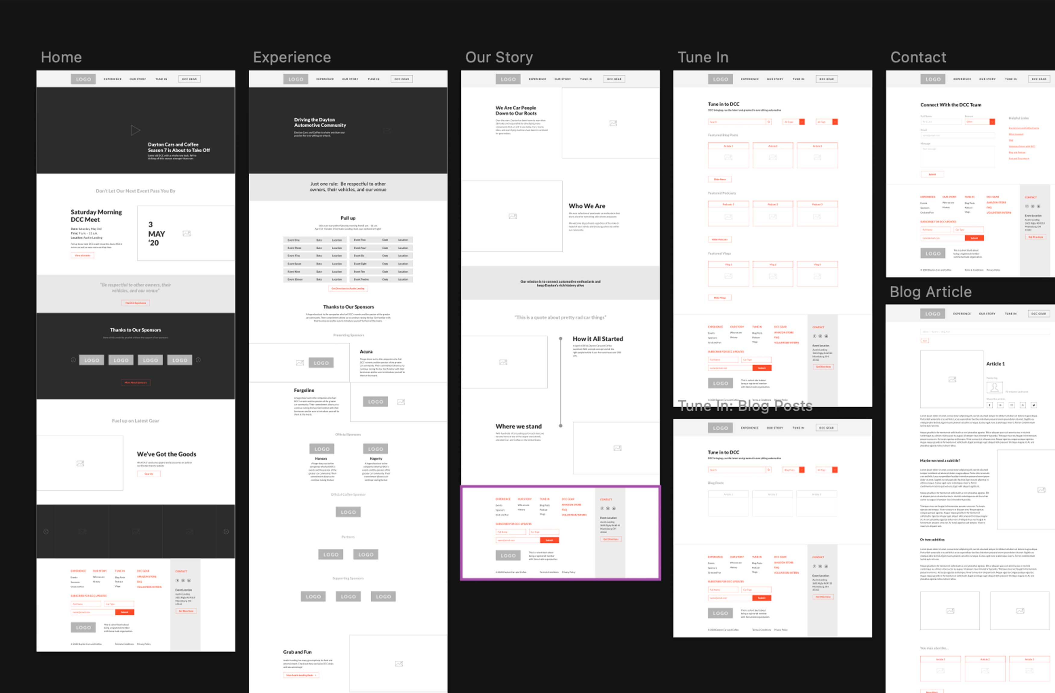
After creating the sitemap, the UX team started working on wireframes for the Dayton Cars and Coffee website. The group created sketches to aid with the implementation of the wireframes. The sketches also allowed the team to visualize the content structure for the site.
I created sketches to understand the flow of each page on the site-navigating where buttons would lead the users to visualize the wireframe prototype.

I led the implementation of the wireframes. I received additional aid from Shelby and Angelica. Together we placed the required content for each page–using my sitemap as a guide.
After establishing the site’s structure, the user experience team created mood boards, style tiles, and sketches to articulate our site research and branding into the website. Each team member designed their comp.
I created style tiles for the Dayton Cars and Coffee site. I took a tablet-first approach since the research showed an unusually large number of tablet users.


The user experience team created their rendition of the home page, which was narrowed down into three compositions. Shelby, Mario, and Angelica’s composition were selected for further implementation.
The team paired into three groups to further develop the design comps.
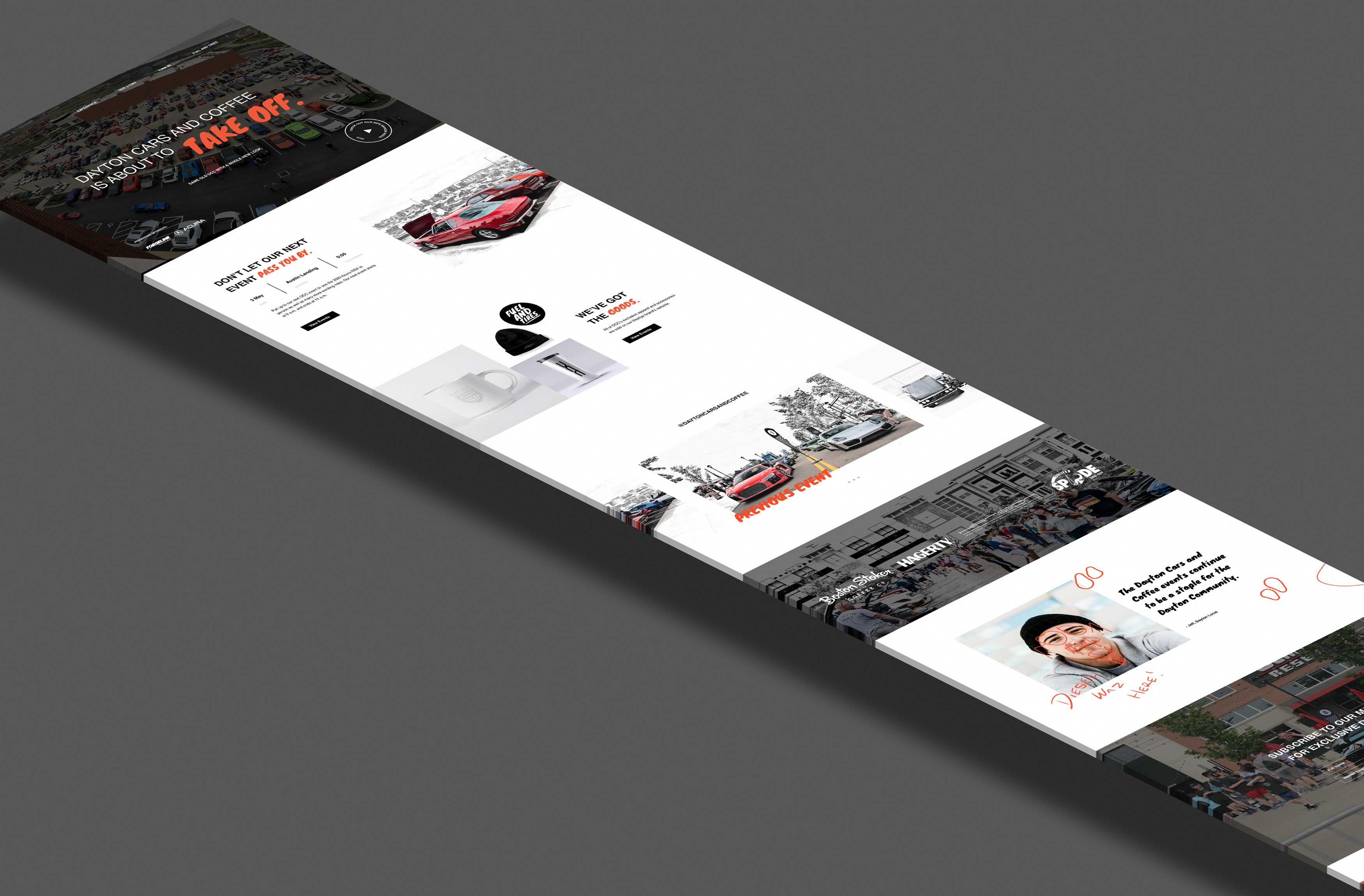
With Mario’s leadership, I helped create Mario’s vision of Dayton Cars and Coffee’s new site. Mario focused on coordinating the site structure while I looked for graphic and photography elements to solidify his direction; together they developed a prototype to present to the client.
Mario and Ally sent the client an additional prototype that addressed his feedback to change specific typography elements and imagery. The client wanted to remove the Fuel and Tire’s font and to remove any cut-outs of cars. Further Development
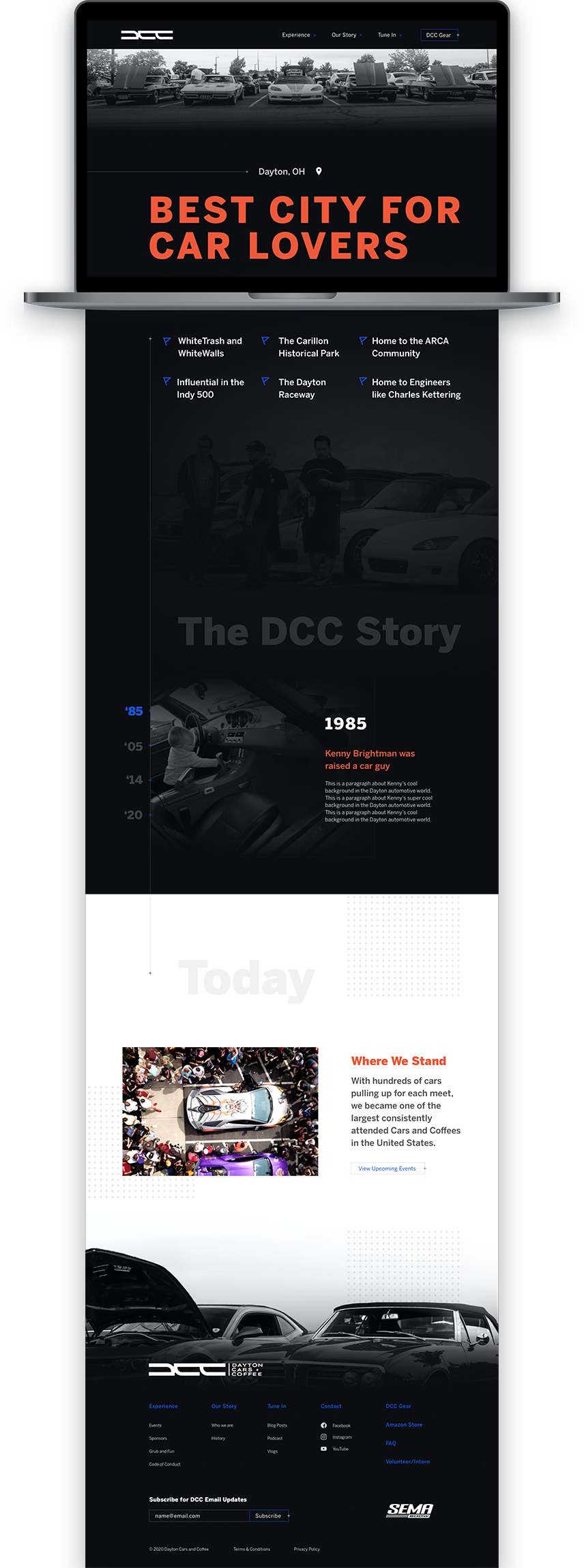
Madison and Shelby assumed the role as the creative director and delegated responsibilities among the team. I often scheduled check-in times with Madison and Shelby to ensure that the story page reflected the site’s design. Since the story page was missing copy and content, I had to problem-solve and create additional content to describe the Dayton Cars and Coffee story.

My responsibility was to complete the Story page for Dayton Cars and Coffee. The story page was missing content and the client could not provide the team with content due to a pandemic. So I used research to fill these content gaps.

Abby Carter made sure all design pages were consistent and matched the brand’s tone and voice. Angelica and Abby created a prototype for UserTesting.com for qualitative feedback and to ensure that the design reflected our recommendations during the delivery stage.
The user testing results confirmed that we accurately met our design expectations. Users loved how Madison and Shelby articulated the experience page and its list of events.
The team relaxed and had a feeling of a job well done. The team ended this project with new insights into the creative development process for collaboration, ideation, branding, digital design, and website design.
The team organized Sketch files for the developer.
Concluding this project, the user experience team provided Dayton Cars and Coffee a new brand, social plan, and website. The final deliverables will increase social engagement, attendees, and strengthen the DaytonCars and Coffee community.

I clarified research findings with Angelica to execute the sitemap for Dayton Cars and Coffee. I lead the execution of wireframes for Dayton Cars and Coffee’s new site. I communicated with the lead designer and design directors to deliver the required content within web pages. I also presented wire frame prototypes and conducted user-testing.
© 2023 Ally Graham